Wednesday, April 27, 2016
Color Theory Final
Each oil pastel painting is each mostly one color and I tried to make designs that reminded me of how that color makes you feel.
Tuesday, April 26, 2016


Project 3


Tuesday, February 16, 2016

Advancing and Receding and Successive Charts
These charts were really interesting to make and I learned a lot about contrasting colors and how cool colors recede into the background.


Project 1 Color Chart and Abstract Painting
I chose to do my painting in red tints and shades because I thought the design of the piece might appear like lava when it was finished.


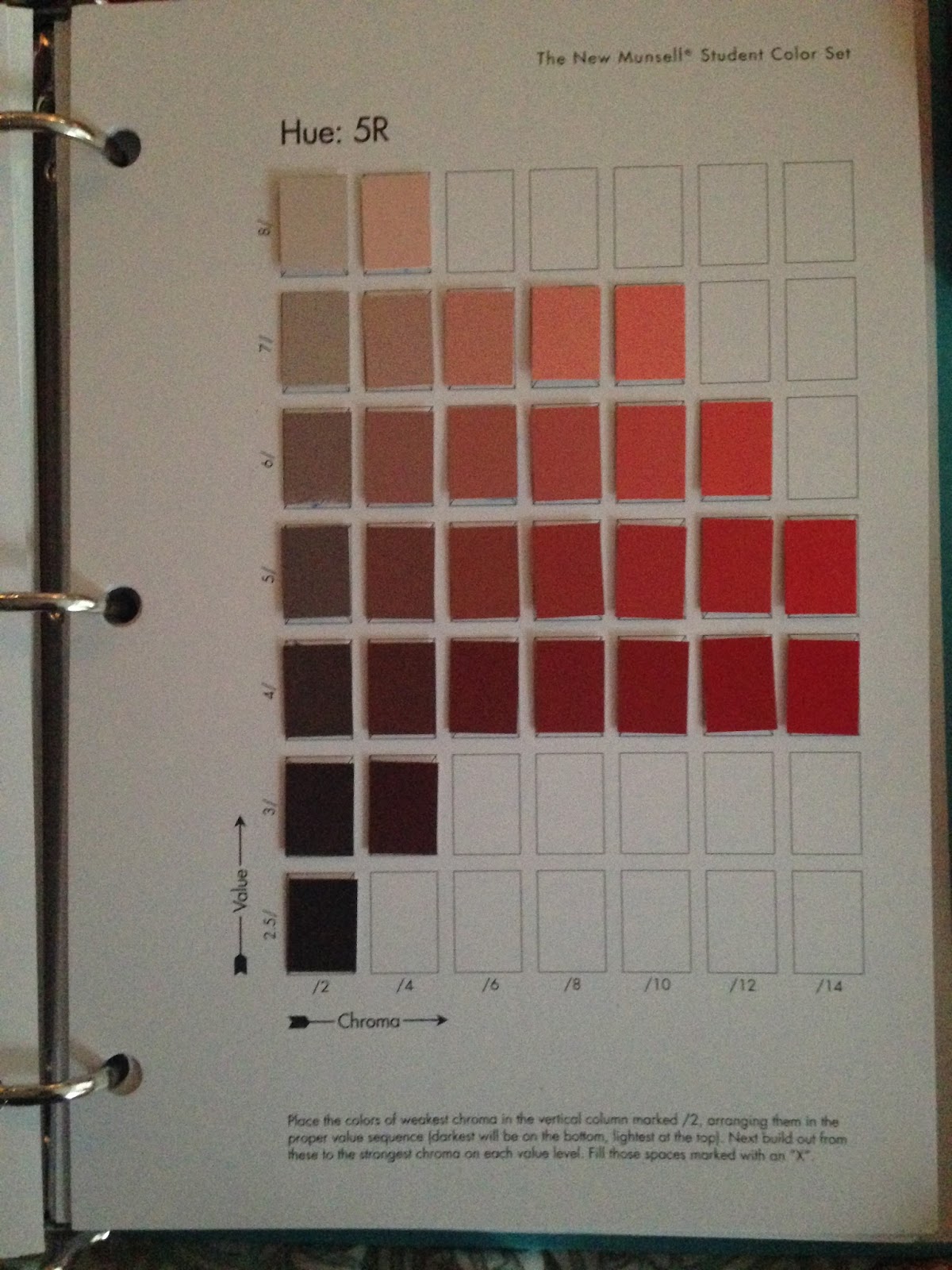
Munsell Charts
Doing the Munsell color charts made me realize there are so many more variations to every color than I had previously thought. I realized I'm not very good at telling the difference between blue and green. These charts weren't too hard for me, but I did struggle with the purple blue and blue green charts.


Thursday, January 28, 2016
Color Usage in Amulet
Amulet by Kazu Kibuishi is my favorite graphic novel series and an excellent example of how to effectively use color in illustration. Kazu uses color to help you know how to feel during certain scenes in the books. For example whenever the characters are in a bad situation or in an unfamiliar or seemingly dangerous place, the color used overall to describe the setting is cool blues and greens.


However when the characters are safe and the main characters are amongst friends, earthier colors are used to lay out the scene.


However when the characters are safe and the main characters are amongst friends, earthier colors are used to lay out the scene.

Subscribe to:
Posts (Atom)